

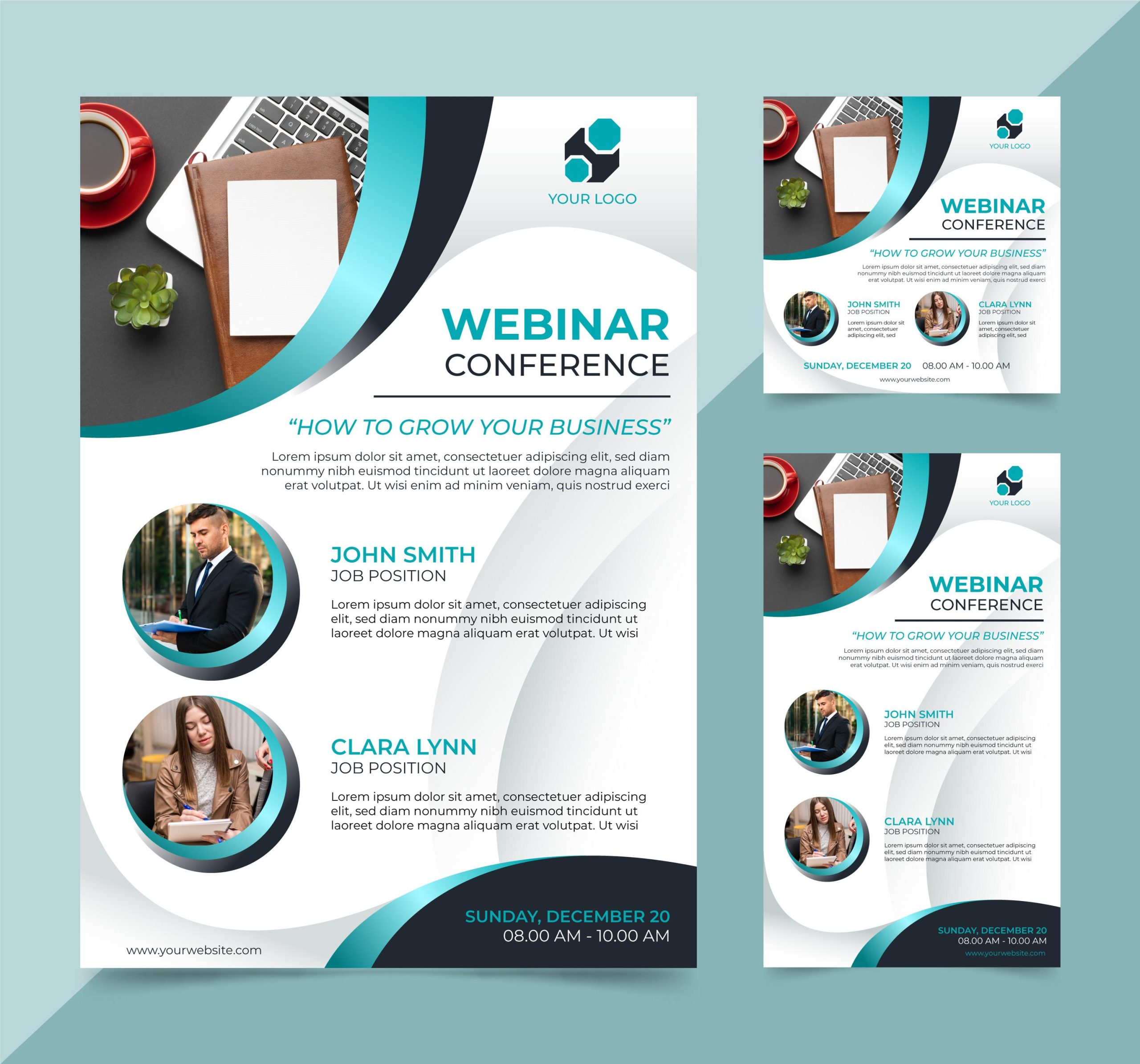

Flyers are still handed out, pinned up, dropped through doors, and left on café counters. What varies dramatically is what happens next. Many slip straight into the bin without a second glance. But some get picked up, held longer, even taken home. Often, that difference begins with the weight of the paper. A flyer printed on a heavier 300 gsm card feels purposeful. It suggests care. It resists creasing and catches the light just enough to hold attention for a few more seconds. And in flyer marketing, those seconds matter.
Yet the tactile experience is only one part of the equation. Visual clarity is just as vital. A well-balanced layout can be remarkably effective in guiding the reader’s eye to the essentials. That means no clutter, no walls of text, and no competing focal points. White space is not a waste—it’s a tool. It frames your message and offers your content room to breathe, particularly in fast-glance environments.
Color has a language of its own. Used wisely, it can direct mood, build trust, or trigger urgency. A flyer’s palette doesn’t need to be loud to be noticed. A local charity’s campaign in Birmingham recently used nothing but black, white, and one shade of burnt orange. It stood out—strikingly simple, visually calm, and brand-aligned. Over the course of four weeks, they saw a notably improved response rate compared to a previous version filled with stock images and primary colors.
Fonts also carry weight, even if that weight isn’t physical. Typography choices influence tone and credibility. Using one or two typefaces consistently—preferably ones aligned with your branding—helps the flyer feel cohesive. Mixing four fonts on a single A5 sheet, however, often creates friction. It’s the visual equivalent of trying to speak three languages at once.
There was a flyer I picked up from a jazz bar in Leeds that managed to say everything without saying much. It used a bold serif for the band’s name, a soft script for the date and time, and left the rest to space and contrast. I didn’t need convincing. I just turned up.
Images and illustrations play a particularly important role when used with intention. High-resolution photography is essential. If it’s blurry or off-brand, it’s better left out. Illustrations, icons, or even minimalist graphics can add an extra layer of clarity without overwhelming the message. For a recent product launch, one agency replaced paragraphs of feature text with four icons, each paired with a five-word descriptor. Response rates went up. Time spent on each flyer doubled.
Then there’s the call to action—the part where too many flyers fall apart. It should be exceptionally clear, unmissable, and impossible to ignore. Whether it’s “Join Us,” “Claim Your Spot,” or “Use This Code Today,” the phrasing must be direct and timely. A local salon used a soft blush-toned flyer with nothing but their logo, a single photo, and the phrase “20% off this week only.” It was quietly persuasive—and surprisingly effective.
Design decisions only work when matched with print quality. Even the most considered flyer loses impact on thin, overly glossy paper. That’s where services like HelloPrint offer a wide range of paper weights suited for various types of flyers, allowing you to select the ideal option based on your specific needs. They help bring a designer’s intention into physical form. A premium design printed poorly feels like a broken promise. But a modest design, well-printed, can still feel premium.
Every element—paper choice, visual structure, font pairing, and call to action—works together. Flyers don’t need to shout to be effective. They need to feel deliberate. The moment someone touches it; they should sense effort. A good flyer earns attention not by being louder, but by being smarter. And that’s what gives it a chance to be read, remembered, and acted on—rather than binned.
